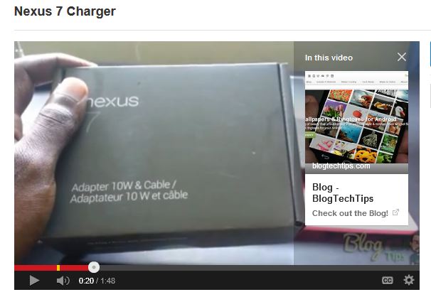
So YouTube is rolling out a new feature right now that is called YouTube cards which is basically a more advanced version of annotations thats awesome in that this new feature will appear on-screen in the upper right and when users click for more information a pop-out box will appear with Card like tabs that when selected can take you to other videos that are related or a website that is chosen by the owner of the YouTube channel it’s on.
What will I need to activate YouTube Cards?
Basically all you need is that your account is in Good standing with Google and it should be in your video edit screen for you to access and start using. You can use up to five (5) of these at once, they also make the screen less cluttered which is great.
What can I link to with these Cards?
With Cards you can link to an article on your website, a video or playlist, an authorized fundraising cause or a merchandising website that on the approved list and in case you are wondering Amazon is not on the list so you are out of luck.
How to setup and use the New YouTube Cards Feature?
To start using cards simply go to Creator studio after logging into your YouTube account:
1. click on your profile picture in the upper right of the screen.
2. Go to video manager and find the Video you want to add a card to.
3. Click edit beside said video and in the editing screen on the editing tab select: Cards
4. Now simply add a card by selecting the Add card option and you will see a bunch of option similar to the ones that you usually get from the annotation options.
The options will include:
1.Associated website
Feature your website
2.Fundraising
Encourage viewers to contribute to your projects on supported fundraising sites
3.Merchandise
Feature a product on supported merchandise sites
4.Video or Playlist
Promote a video or playlist
Simply select the one that you want and customize the options, for example if you chose Associate website and you have already set your associate website in profile settings then you can go ahead and paste the URL and choose a call to action text e.g.”Click here for more info” or so on and create. The button will be displayed in the preview window on-screen so you can see what it will look like.
The cards will show only when the icon in the top left is clicked, it will resemble a “i” . What makes this really cool is that unlike annotations that did not show on mobile devices and phones this will show up on Smartphones and tablets as well. When you click it on a mobile device an overlay appears on-screen from the YouTube App and you can scroll through which is awesome. This will definitely increase click-through from YouTube to your on-screen Annotation in the new card format.
How to see your Cards Analytics?
To see activity on the new cards that you have implemented simply click on Analytics from the edit menu and select cards from the lower left side and you should be able to see your users activities and clicks. Please note that the data will take some time to update, so just like your regular stats give it some time.
What are your thoughts on the Cards, do you love or hate the new feature? In my opinion I love them they look quite cool and are a welcomed refresh from the plain old annotation that can clutter the screen, it seems these will replace annotations all together in the near future. Please share your views in the comments below.


