Eventually we all reach a point where we would like to squeeze the full potential from our blogs and optimize our Adsense Ads to earn maximum revenue. We all have been there and there are things that definitely work and others that do not, to help you our readers we have organised a list of key Google Adsense tips that will have you breaking your own personal earning records with the Adsense program in no time.
To help you better absorb our tips we have prepared an Infographic just for you to outline the key tips that you will need to bear in mind as you design your website and implement your Adsense ads, these Google Ads tips for implementation will sure prove invaluable to you.
Google Adsense tips Infographic to Increase earnings
Our article: Adsense tips to skyrocket your earnings explains each tip in detail from the infographic, provides additional information and takes you step by step as we explain the key tips that you should employ in order to improve Adsense income.
The Infographic outlines key principles such as:
1. Effective Ad Placement
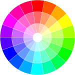
2. Ideal link color selection
3. Best Ad sizes
4. Blending your Ads into your website design
5. Performing Keyword research
6. Getting Targeted traffic
7. Creating fresh content on the regular
The Most important tips to always keep in Mind with Adsense to improve Earnings
#1: Always place a prominent ad unit above the fold such as a 728 x 90 Horizontal rectangle , I have found this to work best between the navigation menu and above the website title.
#2: Place a 300 x 250 rectangle after the title and align with the content, left or right align and experiment to see what works best for you. The same Ad unit also works great half way through the article or high up in the right sidebar.
#3: A prominent position for a Ad unit would be in the left sidebar beside navigation if your website has a left sidebar.
#4: A very large Ad unit such as a 300 x 600 Large Skyscraper works well Mid way down the Right sidebar or at the beginning.
#5: Link units should not be ignored and work well beneath the title or at the end of an article.
#6: Ad units efficiency usually are not very Good way below the fold but the most efficient spots are Just before the comments section or above your recommended articles.
#7: Use the same dominant color as your website default link colors for Adsense titles. Ads however should not be over blended as they will not be seen.
That’s it friend but all the optimization in the world is useless without tuns of traffic so as always you need to create fresh content on a regular basis that people want to read and promote through social media, this should with consistency drive traffic and convert to added income for your blog or website.


